Design Ops
Transforming a Component Library into a Design System
A Design-led transformation that aligned Design and Engineering to create a scalable, accessible design system built for long-term growth.

Introduction
As the Console Connect platform grew, multiple product teams delivered new capabilities across an increasingly complex product landscape. To support this growth, we created Nimbus, a shared component library intended to improve consistency and accelerate delivery.
Over time, Nimbus evolved into an ad hoc collection of components rather than a cohesive design system. Design assets, component implementations and documentation gradually drifted apart, governance became inconsistent, and teams increasingly relied on tribal knowledge rather than shared standards.
The team set out to transform Nimbus into a scalable design system—creating a shared foundation that aligned Design and Engineering, embedded accessibility, established clear governance, and enabled teams to deliver products more efficiently.

Finding a direction
The Nimbus component library provided a valuable starting point, but over time several challenges had emerged that limited its effectiveness and adoption.
Research
Rather than making assumptions, we conducted workshops and interviews with designers and developers across multiple teams to understand the underlying issues and identify the root causes.
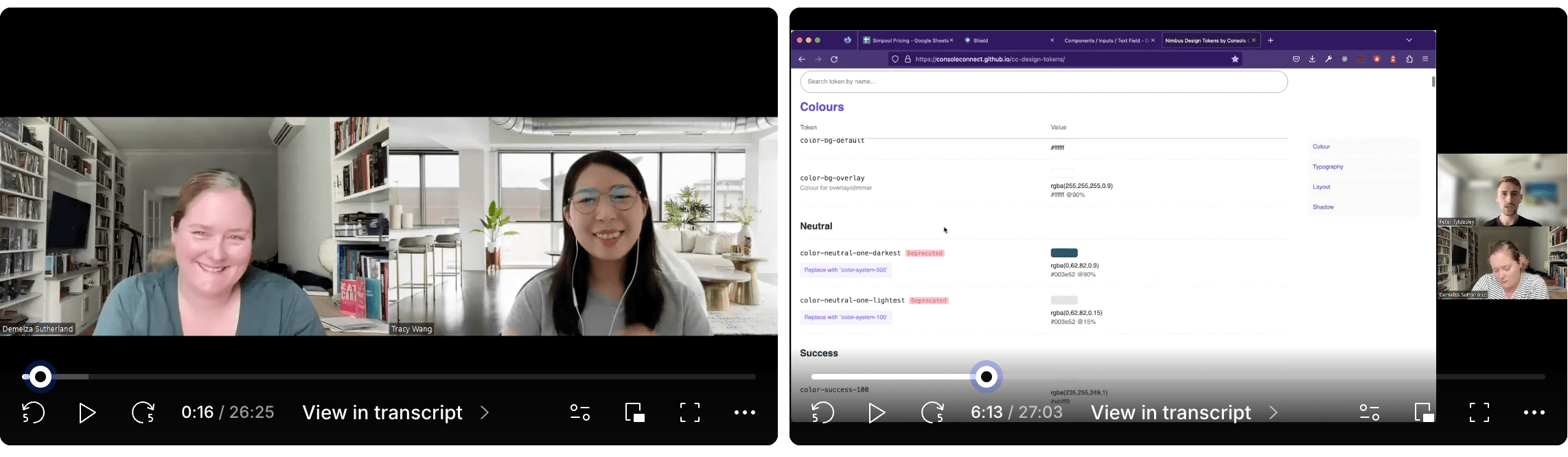
Three consistent themes emerged. These findings highlighted that the challenge was not simply a lack of components, but a lack of shared foundations, governance and ways of working.
Standardisation
Teams lacked clarity around what constituted a core Nimbus component, when new components should be added, and how they should be structured and documented. This led to inconsistent implementations and reduced confidence in reusing existing patterns.
Alignment
Figma UI Kit components did not consistently align with Storybook or production implementations, creating multiple sources of truth. Developers often spent valuable time searching for components or recreating existing patterns, while inconsistencies between design and code increased rework for both disciplines.
Governance
Nimbus relied heavily on tribal knowledge rather than clearly defined ownership, contribution processes and governance. New team members struggled to understand how the system worked, who was responsible for maintaining it, or why it existed. As a result, contributions became infrequent, documentation was inconsistent, and maintaining Nimbus was increasingly viewed as a chore rather than a shared responsibility.
Strategic Reset
The workshops confirmed that the challenge extended well beyond the component library itself. While Nimbus needed stronger technical foundations, it also needed a clearer operating model—one that aligned Design and Engineering around shared ownership, consistent standards and long-term sustainability.
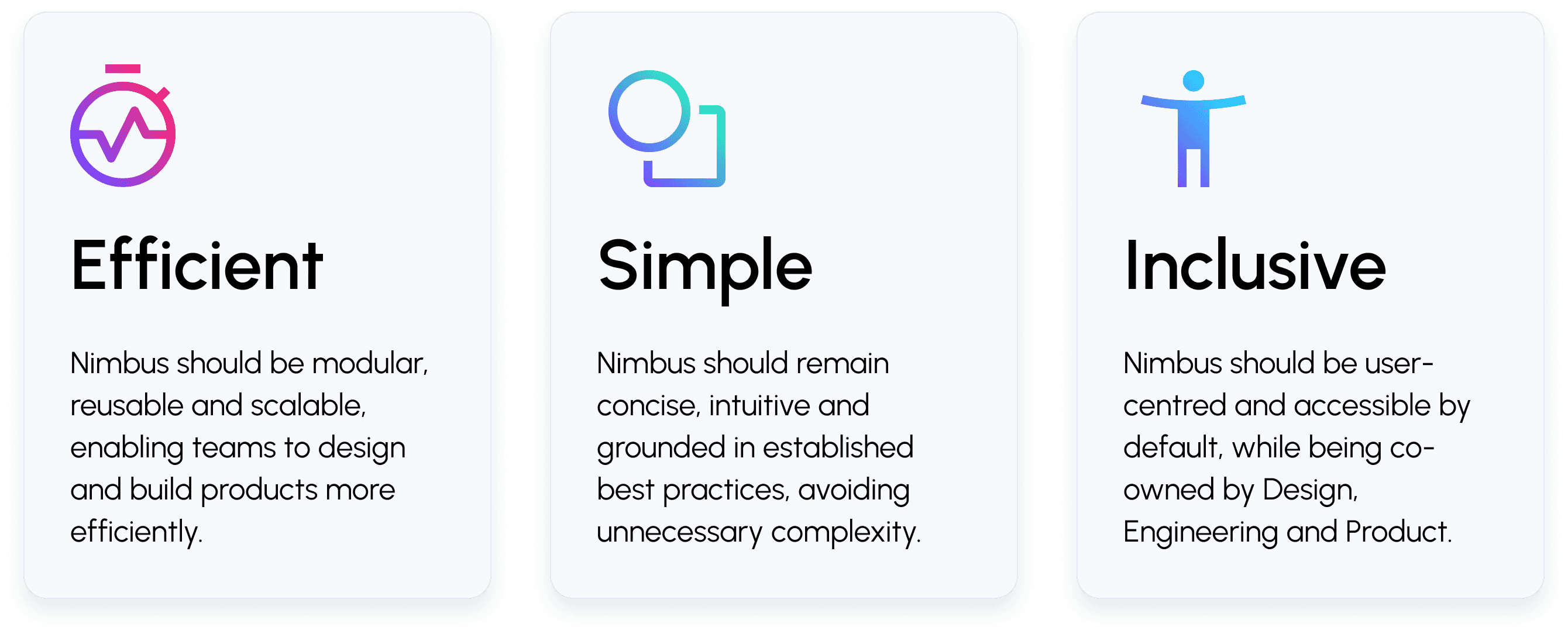
Rather than continuing to evolve the existing library, the team chose to reset the approach. The objective was to create a true design system built on shared ownership, clear governance and a modern, accessible technical foundation. Although the implementation would change significantly, the core principles from Nimbus's original vision remained relevant and were carried forward.
Build or buy?
The team evaluated whether to adopt an existing UI library or build a bespoke design system.
Existing libraries such as Chakra UI and Mantine provided strong foundations, but their rigid approaches introduced constraints around styling flexibility, component behaviour and long-term evolution. Any customisation would also create a fragmented documentation experience, requiring teams to reference both vendor documentation and internal guidance to understand how components should be used.

After a thorough evaluation, the team chose to build its own design system, while leveraging open-source foundations so that we wouldn't be reinventing from scratch. React Aria was selected as the basis for our interactive components because it provided best-in-class accessibility patterns and supported the goal of building a design system aligned with WCAG AA standards.
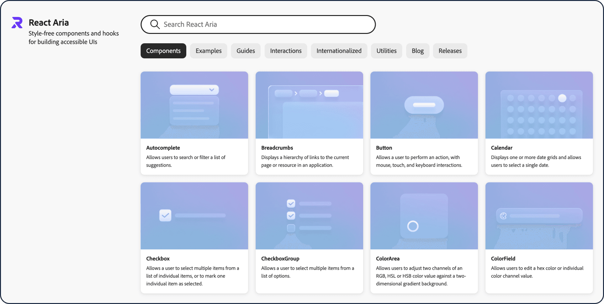
This approach allowed the team to:
Maintain full control over styling, tokens and visual expression
Avoid rebuilding complex accessibility behaviours
Accelerate the implementation of the components needed
Open-source technologies became foundations beneath Nimbus rather than constraints that defined it.
Building
Prioritising impact & accelerating development
Building a design system from the ground up required balancing ambition with practical constraints. With limited dedicated resources and a large number of components to build, the team needed to focus effort where it would create the greatest value.
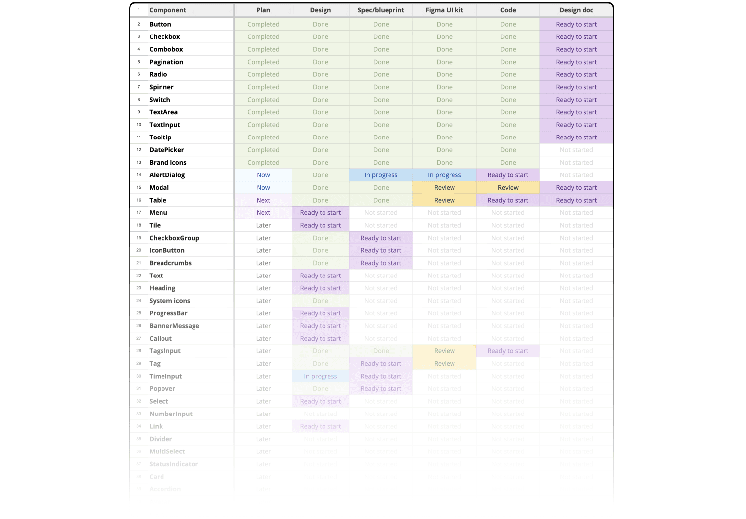
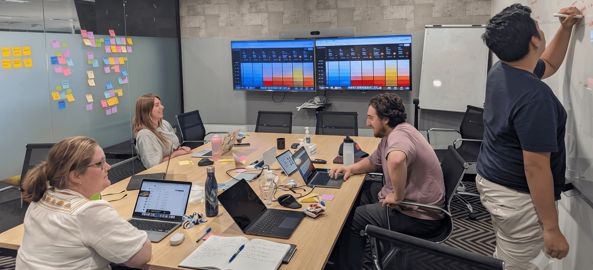
Rather than attempting to rebuild every component upfront, the team ran a prioritisation workshop to map components against Impact and need Vs Effort to design and build. This created a prioritised backlog that guided implementation, ensuring the team focused first on the components that would have the greatest impact on product delivery.
Foundations
The team established a new foundation that prioritised consistency, accessibility, scalability and long-term maintainability.
Flexible and maintainable components
Existing components were carefully assessed to identify behaviours and patterns worth retaining, while removing inconsistencies that had accumulated over time. Each component was designed to be flexible enough to support a range of product scenarios without becoming overly complex, and implemented to meet modern engineering standards for maintainability and reuse.
Accessibility as a foundation
Accessibility was considered from the outset rather than treated as a later enhancement. React Aria was adopted as the behavioural foundation for interactive components, providing robust keyboard interactions, focus management and accessibility patterns aligned with WCAG AA. This allowed the team to focus on creating a consistent visual experience without rebuilding complex interaction logic.
Accessibility also shaped the visual language. The team developed a new colour system from first principles using semantic colour roles, validated contrast ratios and a scalable token structure.A deliberate distinction was made between the Brand Palette and the UI Palette. Brand colours express Console Connect's identity, while the UI palette is optimised for interface hierarchy, usability and accessibility. This ensured products remained visually distinctive while providing a consistent, accessible user experience.
Aligning design and engineering
To eliminate design-to-code drift, the Figma UI Kit and React component library were rebuilt in parallel. Components shared consistent naming, properties and behaviours, making it easier for designers and developers to communicate and reducing ambiguity during implementation.
Storybook as the source of truth
Storybook became the primary reference for implemented components. Live, coded examples provide developers with a consistent and reliable way to understand component behaviour and support faster, more confident adoption across teams.
Rebuilding collaboratively & with AI assistance
A Design-led implementation model
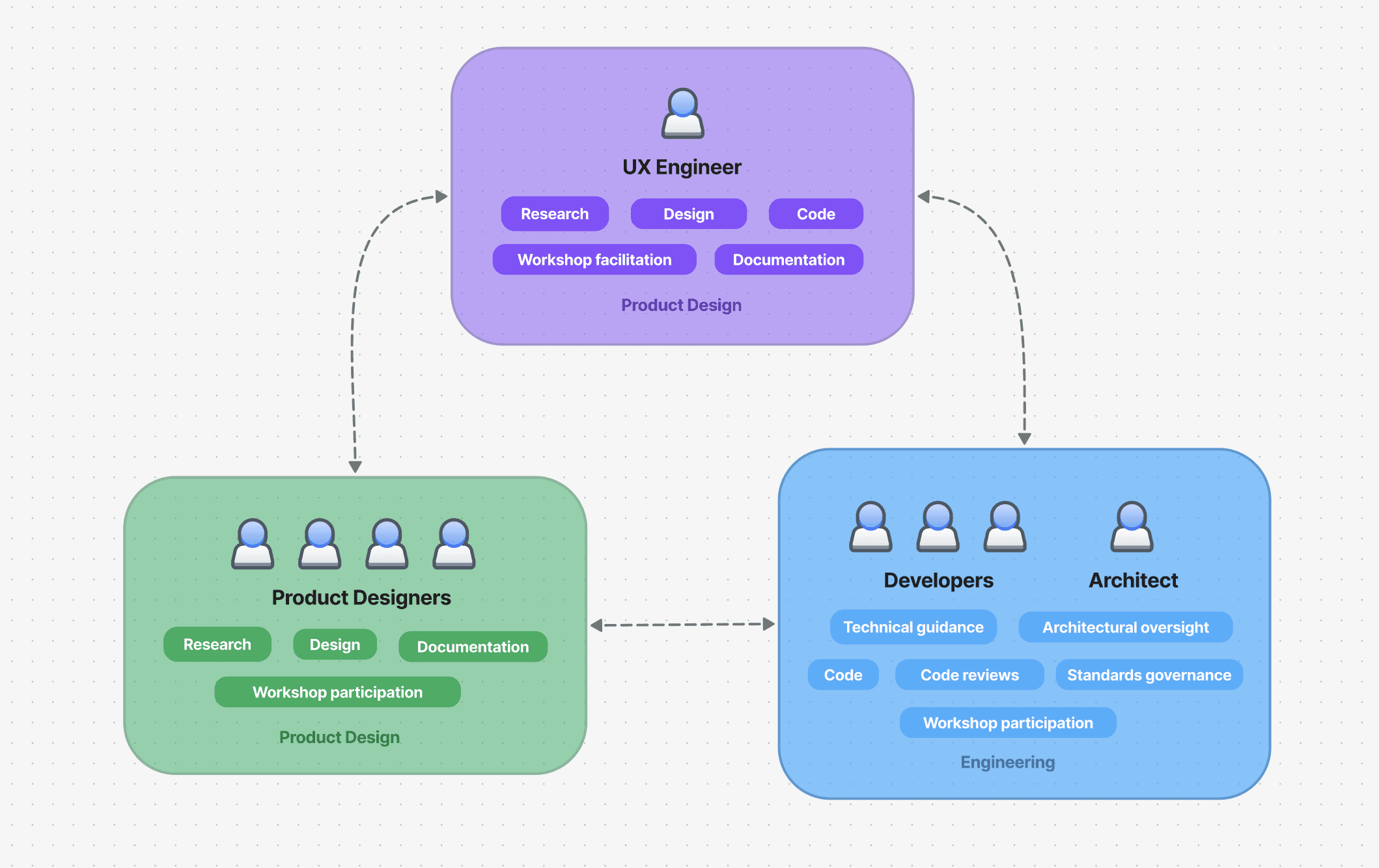
A significant challenge was resourcing. Engineering capacity was focused on feature delivery, meaning dedicated engineering resources were not available for design system development. The only possible way forward was to resource the implementation work within the Design team.
Our UX Engineer was tasked with the bulk of the implementation, with necessary design and engineering support from the respective teams. The Developers also picked up components to build when they had capacity. This setup cultivated shared ownership, while also allowing the system to progress despite limited dedicated engineering capacity.
Accelerating development through dedicated focus and AI
With only a single dedicated resource implementing the design system, AI tooling became an important accelerator.
AI was used to:
Accelerate coding workflows
Reduce repetitive implementation effort
Support translation between design and code
Help reverse engineer implemented components into structured Figma components
Results
Nimbus now provides a single source of truth for designing and building products.
Design tokens, components and naming conventions are aligned between the Figma UI Kit and their React implementations, with Storybook and supporting documentation ensuring Design and Engineering work from the same shared foundation.

Outcomes
Nimbus has evolved from a collection of components into a shared design resource and capability that provides teams with a more consistent and reliable foundation for product development.
Key outcomes included:
Greater consistency between design and implementation
Faster creation of UI experiences with reduced duplication and unnecessary rework
Accessibility embedded into component foundations
Stronger collaboration and shared ownership between Design and Engineering
Reflections
Transforming Nimbus reinforced that a design system is far more than a library of components—it is an organisational capability that depends on people, process and technology working together.
The project itself was far from straightforward. It spanned more than three years, was constrained by competing business priorities, and often progressed in short bursts around feature delivery. Designers and developers frequently had to continue working in the legacy system while the new one was still being built, making momentum difficult to sustain.
Looking back, the biggest challenges weren't technical—they were organisational. Establishing shared ownership, securing time and resources, and building trust between Design and Engineering proved just as important as designing components or writing code. Without clear governance and ownership, even well-designed systems can quickly become fragmented over time.
Perhaps the biggest lesson was balancing collaboration with pragmatism. Design systems require shared ownership, but shared ownership doesn't always mean shared capacity. With Engineering and Product rightly focused on feature delivery, waiting for dedicated resources would have stalled the initiative indefinitely.
Instead, the Product Design team progressed the work wherever possible, while continuously engaging Engineering to validate decisions, provide architectural guidance and shape the system as it evolved. The experience reinforced that meaningful organisational change often starts by creating momentum first, then bringing others along as confidence and value become visible.
Next steps
Nimbus continues to evolve as a living system. The goal is to ensure Nimbus remains a scalable foundation that evolves alongside Console Connect and the teams building it.
Future work includes:
Creating a documentation site with AI-assisted authoring, publishing and maintenance workflow
Automating updates to tokens
Continuing to refine governance and ownership models