Console identity and brand
A scalable brand identity for a fast-moving startup, establishing a distinctive visual system that differentiated Console from traditional enterprise networking.
Brand Design
2018

Introduction
Context
Console is both a network interconnection platform and a social network for the industry—a community of cloud service providers and enterprises, a global physical network, and an automated network management tool in one. It sits at the intersection of infrastructure, connectivity and professional community, aiming to simplify an ecosystem that has traditionally been complex and fragmented.
The problem space
The networking industry has historically been represented through conservative, technical and often intimidating visual language. Branding in the space tended to rely on corporate blue palettes, dense diagrams and abstract infrastructure imagery, reinforcing the perception that the underlying technology was difficult to access and understand.
Opportunity
We saw an opportunity to reposition Console as something more modern and human-centred. Rather than reflecting the complexity of the infrastructure, the brand needed to communicate clarity, accessibility and connection—aligning the visual identity with the product philosophy of designing for people rather than technology.
Solution
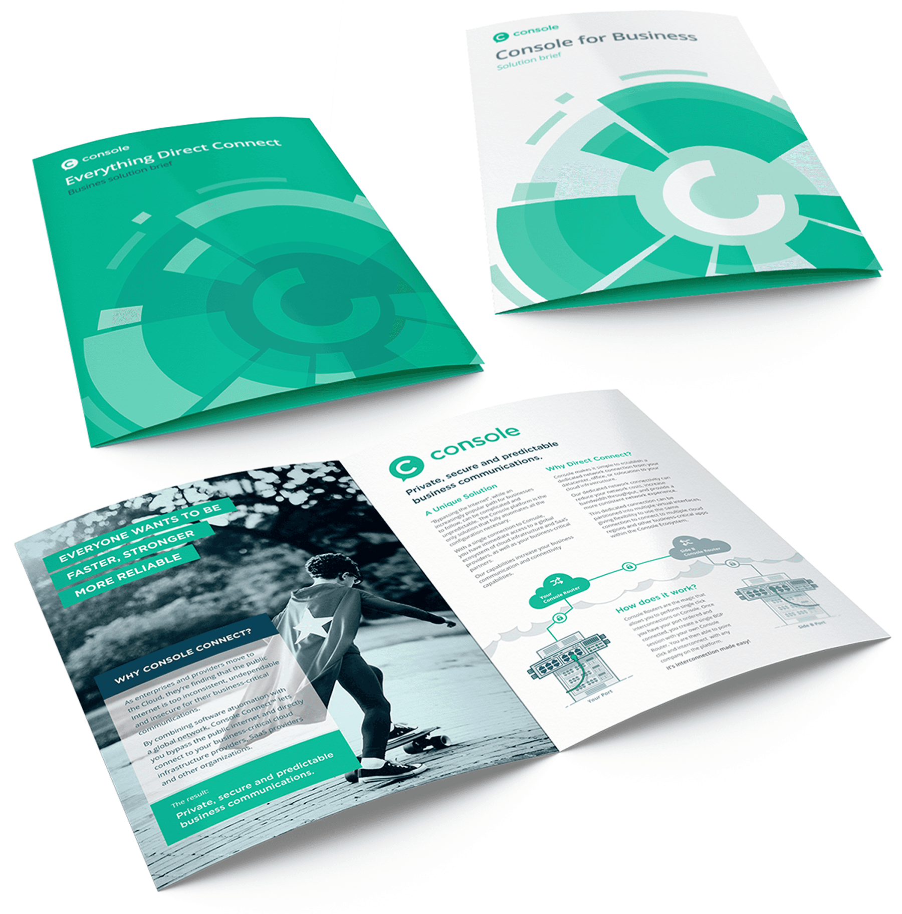
To support a rapidly scaling startup, we created a complete visual identity system including a logo, colour palette, typography and supporting design language. The system needed to be flexible enough to scale across the digital product, marketing, events, sales and investor communications, while remaining consistent and recognisable across all touchpoints.
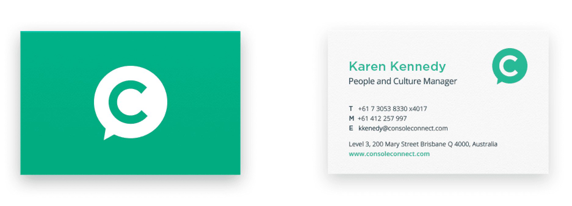
Logo
The logo combines a graphic mark and wordmark, designed to be flexible across a range of contexts and applications, reflecting the multi-faceted nature of the platform.

Graphic mark
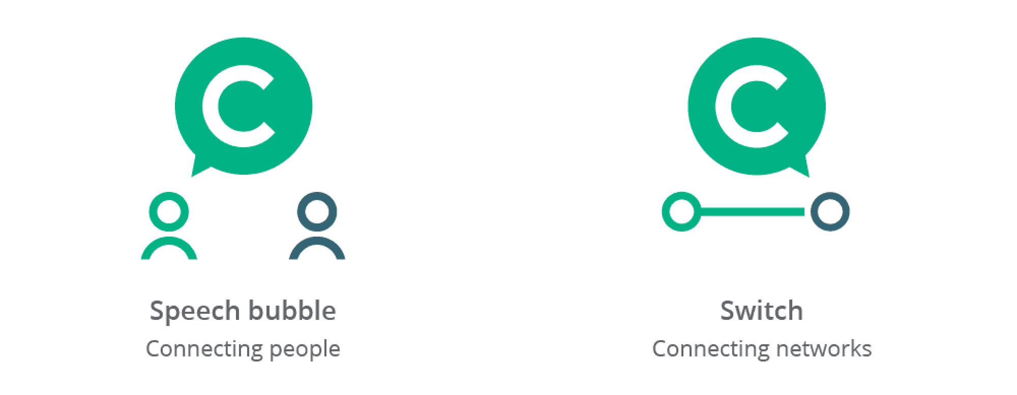
The graphic mark refers to the dual nature of the product: social network and physical network management tool.
Word mark
A geometric typeface was chosen to emulate port symbols (o) and the markings on console dials and switches (c).

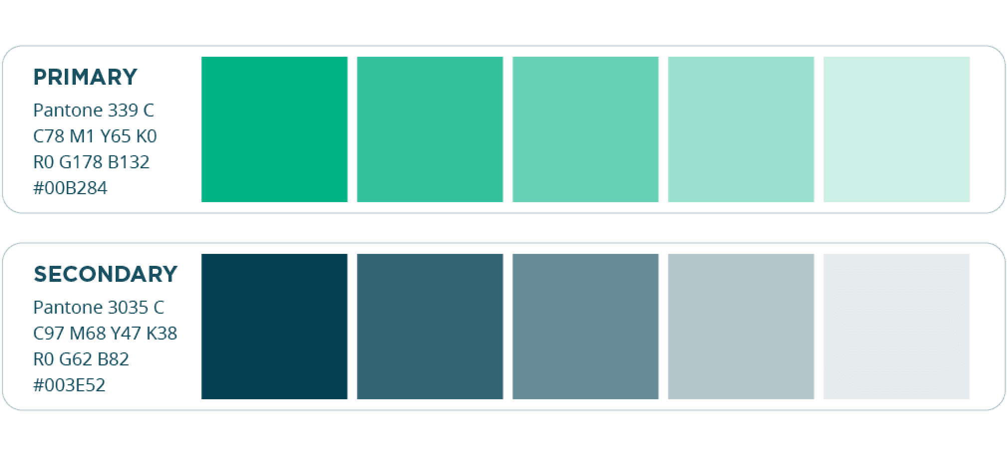
Colours
Green was chosen to reflect the capable, friendly nature of Console. It's also reminiscent of the LED lights in electronic equipment indicating everything is operating well. A limited colour palette is used to create a bold, striking and memorable brand.
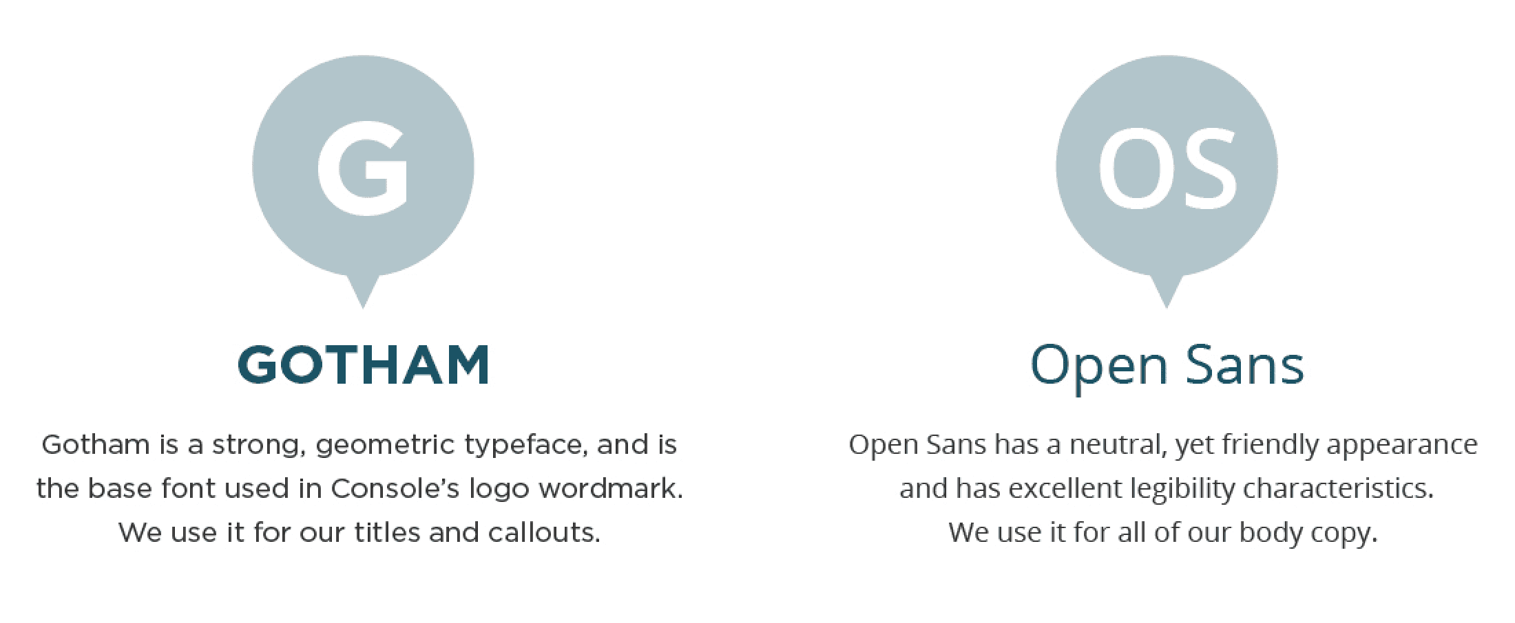
Typography
Tone of voice
Console takes lengthy, complex processes and makes them as simple as possible. It is important this be reflected in our tone of voice. With a work-smarter-not-harder attitude, our tone is fairly relaxed and friendly yet always to-the-point:
“what would a helpful human say?”.


Illustrations
Our illustrations aim to re-assure our customers that when using Console, managing your network isn't complicated or intimidating.
Spot illustrations


Diagrams
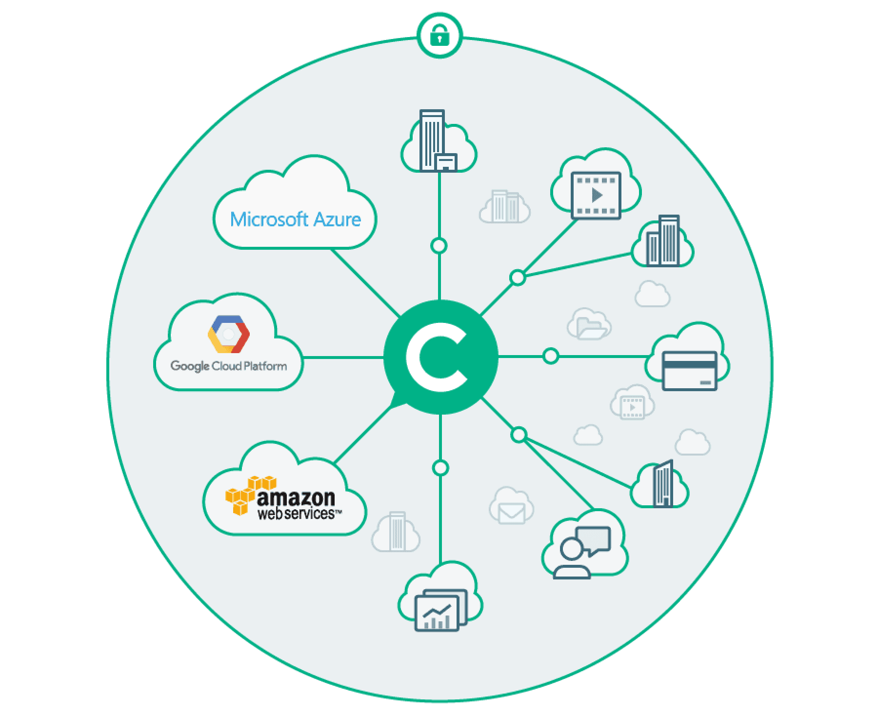
Background device
For background fills in items such as brochure covers and banners we use a graphic derived from the network visualisation used in the Console application. The central 'C' in the graphic links it to the Console logo.


Web


